

A short guide to writing the most important text of any scientific manuscript.
We already have short guides for writing project reports, writing scientific English, and how to write Materials & Methods sections, but today we’ll be looking at the most critical text of any scientific manuscript: the figure legends.
Why are they important?
A well-constructed paper should be intelligible from the figures + figure legends alone. Everything else – the introduction, the Results, the Discussion, the Methods, the References – are ultimately just context, framing, rhetoric, and interpretation. The figures are what you did, and the figure legends describe them. The figure legends, simple as they might seem, are actually the scientific essence of your paper.
How should they be structured?
Each figure in a paper is effectively a mini-project, and consequently each figure legend is like a project report in miniature. Here’s how the component parts of a figure legend are constructed:
1. Figure legend title: the main conclusion from the figure.
2. The conclusion from the first panel.
Methods description for the first panel.
Description of all labels and annotation in the panel.
Details on replicates and what data are shown.
Scaling information if necessary.
3. Repeat step 2 for the next panel (and so on).
Now let’s look at those component parts in a bit more detail.
How should the individual elements be written?
Figure Legend title – what’s the main message from your figure? Summarise the main conclusion from this series from experiments in a single sentence. It might not capture everything in the figure, but it’s essential that it communicates the most important finding from these datasets. This should be a single sentence, and ideally just a single clause (i.e., no comma). Try to use strong, positive titles and not wishy-washy ones that sound unfocused and vague. Use the present tense.
Conclusion from the first panel – describe the conclusion presented by the data in the first panel. This follows the same rules as the figure legend title, but refers only to the data in the panel. One sentence, ideally one clause, and in the present tense. Short, strong, and precise.
Methods description for the first panel – there’s a bit of a judgement call here, as the methods description should not be as detailed as in the Materials & Methods (otherwise your figure legend is going to get overlong), but it does require more technical detail than in the Results section. The reader should be able to understand what kind of experiment was done, and what the experimental conditions were (with any further details available in the M&M, of course).
Description of all labels and annotation in the panel – this sounds simple, but it’s amazing how often it’s not achieved. Go through the figure panel and make sure that everything in it is described. Everything. Not just what the panel image shows, but every label, every abbreviation, every number, the lot. There should be zero ambiguity about what is being presented.
Details on replicates – mention how many technical replicates were used to obtain reported average values, how many biological replicates were assayed, and how many independent experiments were done (if you’re not clear on the difference between these terms, see our short guide on the topic). Say what kind of average you’re showing (median, mean, geometric mean, etc), and what the error bars show (standard deviation, confidence intervals, etc). When the data panel is an image, say that an “exemplary” image is shown and not a “representative” one – panel images are almost never “representative”, as they’re invariably the best that you have. If you have carried out statistical significance tests, state what they are and what significance thresholds are shown.
Scaling information – for panels containing images (that includes protein structures!), mention the length of the scale bar so that the reader has a rough impression of the size.
What do I do when I’m finished?
When you’re done, leave it for a day or so to freshen your mind, then sit down with both the figure and the figure legend, and go through the latter line by line to check that every feature of each panel has been specifically described so that there is no ambiguity.
What other things should I pay attention to?
Try to make sure that your legend can fit on the same page as the figure. It is extremely difficult for readers to interpret a figure if the legend is not nearby, and some journals use peculiar placements when legends can’t be accommodated alongside the figures they describe. If it’s not possible to accommodate both the figure and the legend on a single page, then you should give serious thought to splitting the figure into two – you are probably trying to present too much data at one time, which can be overwhelming for the reader.
When should I prepare the figure legend?
As noted in our post on preparing papers and project reports, the first thing you build should be the figures. Similarly, the first thing that you write in full should be the figure legends. Remember too that although all this might seem time-consuming, when you have completed the figures and figure legends, you have actually done around 70% of the work for the entire paper. Things get problematic if people start by writing the results and then try to prepare figures that fit them…
What’s a good example to follow?
Now we’ll take a look at a couple of examples, both taken from Guo et al., 2021 in the Journal of Cell Science. If you’re looking for template examples, this is one of the best recent papers you can use.
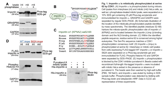
First up, here’s Figure 1 and its associated legend:
Now let’s partially dissect it to appreciate the precision of the writing.
Figure legend title: Importin α is mitotically phosphorylated at serine 62 by CDK1.
It’s short, it’s punchy, it’s very precise, and it tells you exactly what to expect from the subsequent panels.
Conclusion from panel A: Importin α is phosphorylated during mitosis.
Again, short and to the point. No ambiguity, and the reader knows exactly what to look for.
Methods description from first panel/Description of labels and annotation:
I won’t copy this out in full, but take the time to go through the panel text for Fig1 and note how literally every single label in the panel is painstakingly referenced here. There is zero ambiguity about what is being shown. Then go through the other panels in the figure and note again how there is absolute clarity about what’s being shown thanks to the figure legend text.
Details on replicates:
Instead of coming at the end of the panel A description, this is gathered together at the end of the figure legend – “Data in A,D,E are representative of three experiments”. As noted above, this probably isn’t the case – it’s a fair bet that the images shown are the best (the exemplary ones) of the three, rather than the middle-ranked (representative) one.
And as a second example and this time featuring imaging data, let’s look at Figure 3 from the same paper:
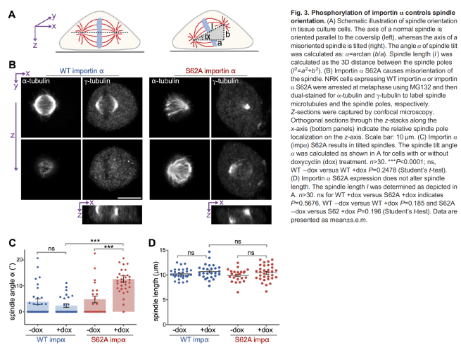
Figure legend title: Phosphorylation of importin α controls spindle orientation
Again, short and to the point. No excessive hype, no overinterpretation, just a clear and succinct description of the main finding from the data presented.
Conclusions from panels:
Look at each panel and note how the first sentence tells you exactly what the conclusion from that experiment or dataset is.
Methods/labels description:
As in the first example, there’s precise and succinct description of what was done, and what’s being shown. Note how much clearer the schematic in panel A is thanks to a full description of the terms. Note how the panel B description describes both the experiment and the data acquisition, and what is being shown. Scaling information is provided.
Replicates description:
Panels C and D are dot plots – note how the sample size (n>30) is noted. At the end of the legend the data presentation is provided (means +/- SEM). The authors have opted to use statistical significance testing (it’s worth noting that the use of significance tests in cell biology is coming under closer scrutiny thanks to frequent misapplication – don’t use one if you don’t know how it works!), and note both the test employed and the significance thresholds being shown.
Caveat/disclaimer:
As with all science writing, there are many different ways to achieve the same ends, so this should be regarded as one possibility amongst several. You will be able to read a multitude of variations on these rules and as with most writing, developing a style that works for you is important. Ultimately, if the reader can understand what is being shown in the figure without consulting other sections of the paper, then the figure legend has been well-written. Take note of papers that have well-written legends and store them for consultation should you have to write up data that utilises similar techniques.
It’s important to note too that some journals have quite prescriptive requirements about what should and shouldn’t be included, and that these can differ markedly from one journal to another. Posting your paper as a preprint to bioRxiv will probably (should!) be your first destination and in that sense you have total control over presentation – but if you already know what journal you’d like to send it to, do take the time to check over their requirements so that you don’t diverge too much. Progressive journals like the Journal of Cell Biology and the Journal of Cell Science accept format-free first submissions, but more conservative journals may not, in which case you will need to make some decisions.
Acknowledgements:
Thanks to Joachim Seemann for agreeing to let us feature his lab’s work in this posting, and to Helena Jambor for input and advice.

5 thoughts on “The devil in the details (a short guide to writing figure legends)”